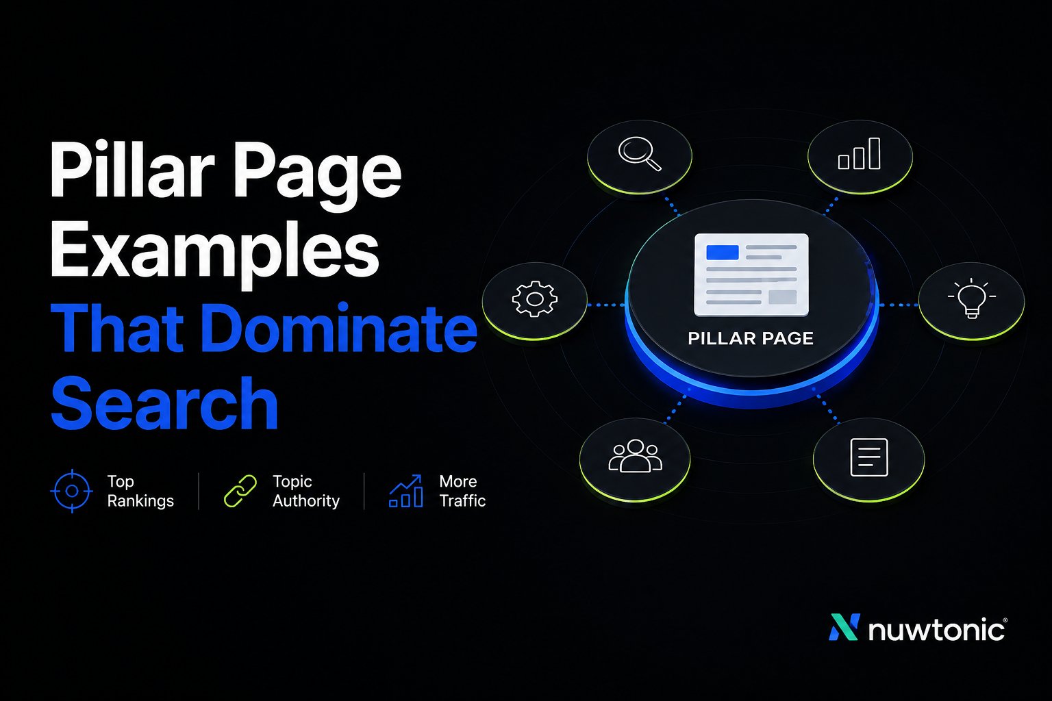
Most pages branded as pillar pages are just long blog posts with a menu bolted on. The ones behave like topical hubs, and that distinction matters because Google can only trust what your site organizes well, not what your design team labels nicely. The strongest examples pair long-form coverage, supporting cluster links, and a clear reader path, which is exactly why topic-cluster SEO keeps showing up as the structural model that works. If you want to master technical SEO for authority, start by treating the page as an architecture problem, not a writing exercise.
The four lenses below are the same ones I use when auditing pillar content: information architecture, internal linking topology, schema and E-E-A-T signals, and the content brief behind the page. A real pillar page should make the topic obvious, keep readers moving, and give crawlers a clean map of what lives where. That's the difference between a page that earns links and a page that merely looks exhaustive.
Table of Contents
- 1. Typeform
- 2. Ahrefs
- 3. Backlinko
- 4. Shopify
- 5. BigCommerce
- 6. Asana
- 7. GoodUI
- Top 7 Pillar Page Examples, Comparison
- Your Pillar Page Blueprint Ship One in the Next 30 Days
1. Typeform
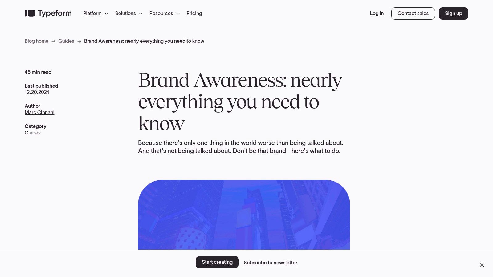
Typeform's brand awareness guide is a strong pillar page because it behaves like a teaching asset first and a conversion page second. The page opens with visible navigation, uses anchor-linked sections, and keeps promotion light until the end, which is exactly what readers need when the query is exploratory rather than commercial. The result is a clean hub that can support multiple cluster angles without feeling like a sales deck.
Typeform Information Architecture
The structure is the main reason this page works. Typeform uses a visible table of contents and sticky navigation, so readers can jump directly to definitions, frameworks, and examples instead of scrolling through an oversized narrative. That matters because pillar pages only work when the page makes breadth feel navigable, not punishing.
This page also benefits from clear chunking. Each section answers one question, which makes the guide easy to map into spokes like brand recall, awareness metrics, and survey design. That's the right pattern for a hub page, because it creates a clean parent-child relationship between the broad topic and the deeper cluster articles.
Typeform Internal Linking Topology
The linking pattern is disciplined. You get contextual links where the reader needs them, not a wall of blue text in the intro. That keeps the page readable while still giving crawlers enough signals to understand topic breadth.
The practical lesson is simple. Put one relevant cluster link in the section where the subtopic appears, then keep the rest of the link graph for supporting pages. That's how you build a usable pillar, not a self-linking maze.
Practical rule: If your pillar page needs more than a few clicks to reach the next logical subtopic, the architecture is already too loose.
Typeform Schema and E-E-A-T Signals
Typeform strengthens trust with outbound citations and a freshness signal through its update date, which is a useful combination for a pillar page on a broad marketing topic. The page doesn't hide behind vague brand language. It shows readers where the ideas come from, then keeps the product pitch mostly out of the way.
The trade-off is that the design can be heavy on slower connections, and it's not built around structured FAQs that LLMs can quote easily. Even so, it remains a solid model for any team that wants a pillar page to read like a credible guide, not a landing page pretending to be educational.
Typeform Content Brief
The brief behind this page is teach-first. It favors definitions, examples, and frameworks, then places conversion language later, which is the right sequence for top-of-funnel discovery. That's also why the page can be repurposed into spokes without needing to rewrite the entire structure.
Use this as the model when your topic needs explanation before evaluation. If you're building a hub around awareness, category education, or conceptual buying stages, this format gives you the cleanest path from search intent to internal navigation.
The live page is here, Typeform's brand awareness guide.
2. Ahrefs
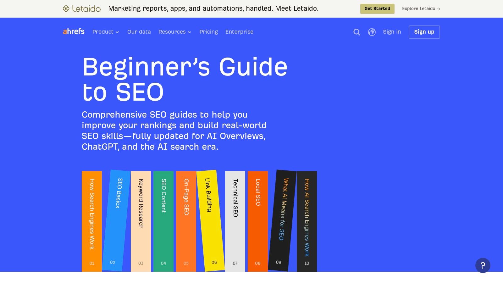
Ahrefs is the clearest example of a hub-and-spoke SEO pillar that teaches a discipline instead of merely defining it. The Beginner's Guide to SEO sits at the center of a broader educational system, and that's what makes it durable. Readers get a guided path through the subject, while crawlers get a very obvious topical map.
Ahrefs Information Architecture
The chaptered structure is textbook good IA. Ahrefs breaks SEO into foundational areas, then fans out into deeper resources like on-page SEO, internal links, and keyword research. That creates a hierarchy readers can understand in seconds, which is essential for a technical topic that could otherwise sprawl.
This is the model to copy when your topic has enough subdomains to justify a full content tree. Don't try to cram every nuance into one page. Build the hub to define the territory, then let the spoke pages do the specialist work.
Ahrefs Internal Linking Topology
Ahrefs crosslinks aggressively to foundational resources, and that's the right move because the page is designed as a central node, not a dead end. The internal links guide readers into adjacent skills while keeping the main guide intact as the canonical overview.
There's also an important tactical lesson here for teams comparing tools in the SEO space. A pillar page should help readers progress through the topic, even if they eventually need alternatives or adjacent workflows. For a practical example of how comparison content fits into that ecosystem, see this Ahrefs alternatives breakdown.
Ahrefs Schema and E-E-A-T Signals
Ahrefs leans hard on author credibility, frequent updates, and data-backed visuals. Those are strong E-E-A-T signals because they show the page is maintained by people who work in the field, not a generic content machine. That matters in SEO, where stale advice ages badly and ranking guides need regular cleanup.
The product also helps the page feel grounded. Tool walkthroughs and examples make the content operational, which reduces the gap between theory and practice. For a pillar page, that's more valuable than polished marketing copy.
Ahrefs Content Brief
The content brief is built for practitioners who want the full map of SEO, not a surface-level summary. It assumes readers may already know some basics, so it layers the information from fundamentals into deeper execution. That makes it especially useful as a template for B2B software education hubs.
The downside is that the page can feel jargon-heavy for beginners, and some visuals lean product-led. Still, if your goal is to show how a pillar page supports authority in a technical category, Ahrefs is one of the most instructive examples you can study.
3. Backlinko
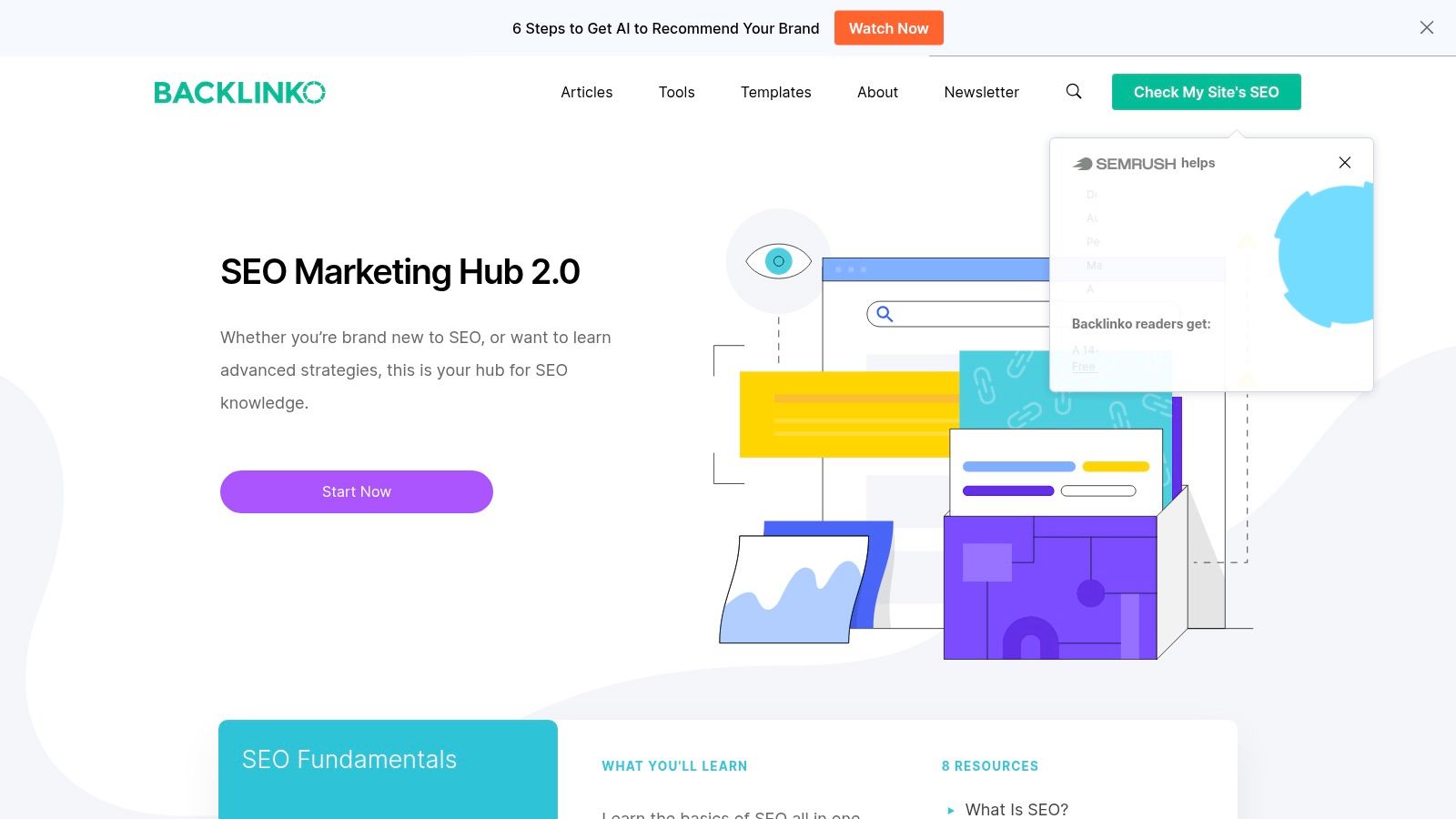
Backlinko's SEO hub is built like a library entrance, not a standalone article. That distinction matters because the page is designed to route users into the right sub-hub fast, then let those sections carry the deeper educational load. It's a strong example of how a pillar page can act as a content router for a large SEO system.
Backlinko Information Architecture
The page uses a hub of hubs pattern, which is the right structure when one topic branches into multiple major disciplines. Technical SEO, link building, keyword research, and other subtopics are grouped semantically so users immediately know where to go next. That makes the page highly discoverable without making it feel bloated.
This is a particularly smart model for teams with a broad content library. Instead of treating every article as a peer, Backlinko gives the site a clear hierarchy. The pillar sits on top, sub-hubs sit beneath it, and individual articles support the whole system.
Backlinko Internal Linking Topology
The crosslinking is extensive, which strengthens the page's information scent. Readers can move from the hub into a sub-hub, then into an article, without losing context. Crawlers get the same benefit, because the site architecture signals that these topics belong together.
That said, not every page in the broader library needs the same depth. Many teams mess up. They copy the structure but not the editorial discipline, and the result is a network of shallow pages that all point at each other without adding real value.
The best hub pages don't just connect content. They explain why the next click matters.
Backlinko Schema and E-E-A-T Signals
Backlinko benefits from a strong reputation and a familiar teaching style that marketers already trust. The page also uses design elements like breadcrumbs and sectioning that help orientation, which supports credibility because the page feels maintained, not abandoned. That's important for a topic as saturated as SEO, where audiences are wary of recycled advice.
Visual ads and CTAs can distract on smaller screens, though. That's the trade-off of a content library that also needs to support the business. The lesson is to protect the reading flow before you optimize for monetization.
Backlinko Content Brief
The underlying brief favors structure over flourish. It's built for readers who want a practical entry point into SEO, plus clear next steps into deeper material. That's exactly what a pillar should do when the topic is big enough to require multiple layers.
Use this model when the parent topic has many legitimate subdomains and you need a content ecosystem, not a single hero page. The stronger your internal taxonomy, the more useful this pattern becomes.
For reference, the broader resource hub lives at Backlinko's SEO hub, and the adjacent link-building content can be explored through this Backlinko backlinks guide.
4. Shopify
Shopify's ecommerce SEO guide is a practical pillar page because it speaks in business outcomes, not marketing abstractions. Traffic matters, but only because traffic can become sales, and the page keeps that connection visible throughout. That makes it especially useful for ecommerce teams that need content to justify revenue impact.
Shopify Information Architecture
The page uses a What, Why, How structure, which is one of the easiest formats to execute well on a commercial informational query. It gives readers a definition, a reason to care, then a path to implementation. That sequencing works because it mirrors how ecommerce teams evaluate SEO.
The page also breaks the subject into tactical sub-sections. That matters in ecommerce, where category pages, product pages, and content pages each need a different optimization lens. A good pillar page should make those distinctions obvious instead of flattening everything into one generic “SEO tips” list.
Shopify Internal Linking Topology
Shopify links into deeper ecommerce SEO resources, which is exactly what a pillar should do. The hub page gives a broad overview, then routes readers into more specific execution pages and tools. That keeps the main guide from becoming a dead-end summary.
The internal links also support merchant intent. A reader who lands on the guide probably doesn't need theoretical education alone. They need a path from diagnosis to action, and the link structure is what makes that transition possible.
Shopify Schema and E-E-A-T Signals
The page benefits from author and date transparency, which are basic but important trust signals. It also frames the topic around retail outcomes instead of generic ranking talk, which helps it read like a working guide for operators. That's useful for searchers who care less about SEO jargon and more about what moves a storefront.
The downside is platform bias. Shopify-specific advice can narrow the page's usefulness for non-Shopify merchants, so teams should avoid copying the framework too closely if their stack is different. The structure is portable, but the examples need to fit the reader's environment.
Shopify Content Brief
The brief is clearly tuned to people who manage products, collections, and store performance. It isn't trying to impress SEO purists. It's trying to help merchants understand where optimization affects sales, and that makes the page more useful than a generic overview.
If you're building pillar content for ecommerce, this is the standard to beat. Keep the page grounded in commercial outcomes, then use cluster content to handle the platform-specific or category-specific details.
The page is here, Shopify's ecommerce SEO guide, and the related technical angle for merchants sits here, technical SEO for Shopify.
5. BigCommerce
BigCommerce takes a more current, more operational approach to ecommerce SEO. The page doesn't just explain optimization basics, it also addresses AI summaries, SERP shifts, and structured data, which makes it feel built for teams that need to keep up with search changes as they happen. That timeliness is a major advantage when the category itself is in motion.
BigCommerce Information Architecture
The page is broad enough to function as a true hub, but it still keeps the topic anchored around category and product page optimization. That's the right move for ecommerce because those page types drive most of the implementation work. Readers don't need a theory dump. They need to know what to change first.
BigCommerce also supports the page with downloadable PDF material and strong internal navigation. That helps teams share the guide internally, which is often underrated. In-house stakeholders are more likely to act on a pillar page when they can reuse it in planning and training.
BigCommerce Internal Linking Topology
This is one of the cleaner examples of a pillar that balances education with conversion. The links send readers into related BigCommerce resources, but the navigation never feels chaotic. It's a practical system, not a content dump.
The free-trial CTA path is a deliberate choice. It keeps the educational guide connected to product evaluation without interrupting the reader too early. That works best when the audience already understands ecommerce SEO and wants to apply it in a platform context.
Practical rule: If your pillar page is built for buyers close to evaluation, put the product path in the architecture, not just at the end.
BigCommerce Schema and E-E-A-T Signals
BigCommerce's biggest credibility signal is freshness. The page is current, which matters in a space where search behavior and SERP features change quickly. It also discusses structured data and AI overviews, which shows the content reflects present-day search realities instead of old SEO habits.
The trade-off is heavier product messaging. A more neutral educational audience may feel pushed toward a platform sooner than they want. Even so, the page does a strong job of pairing authority with application.
BigCommerce Content Brief
The brief is more commercial than purely informational. It assumes the reader may be comparing implementation paths and wants to know what modern ecommerce SEO requires right now. That makes it a useful model for companies that want a pillar page to educate and convert at the same time.
The page works because it doesn't hide the product angle. It uses it as part of the journey. That's the right compromise for high-intent ecommerce topics.
The guide lives at BigCommerce's ecommerce SEO resource.
6. Asana

Asana's project management resource hub is less of a single article and more of a navigational pillar. That's exactly why it works. Instead of forcing every concept into one narrative, it organizes related learning paths into a card-based system that helps users find the right depth quickly.
Asana Information Architecture
The taxonomy is organized by intent, with categories like skills, planning, tools, and strategy. That structure is smart because it mirrors how people approach project management problems. Some readers want basics, others want templates, and others want strategic guidance.
The card layout keeps the page digestible. Each resource sits inside a clear container, which makes the hub feel curated instead of cluttered. For teams building a knowledge center, that's a far better user experience than a giant undifferentiated list.
Asana Internal Linking Topology
Asana's hub works because each card leads to a specific cluster of content, and the page is built to reduce pogo-sticking. Readers don't have to bounce back to search after every click because the hub keeps offering a sensible next step. That's a real retention advantage for B2B SaaS content.
The trade-off is that this format leans more toward aggregation than deep on-page anchoring. If you need a classic long-form pillar with a dense narrative and TOC-driven scannability, this is a lighter model. If you need a discovery layer for many related resources, it's excellent.
Asana Schema and E-E-A-T Signals
The page benefits from evergreen content and newer dated articles in the ecosystem. That creates a sense that the resource library is alive and maintained. In a category like project management, that matters because readers expect practical guidance that matches how teams work now.
The main weakness is overlap. Resource categories can blur, which makes the taxonomy harder to maintain over time. If you copy this model, keep the naming tight and resist the urge to add a new card for every adjacent idea.
Asana Content Brief
The brief behind this hub is not “explain project management once.” It's “create a guided library that supports multiple intents.” That's why it works for top-of-funnel and mid-funnel traffic at the same time.
Use this model when your audience needs choice, not linear reading. It's especially strong for B2B SaaS companies that want a central learning area rather than a single mega-guide.
The hub sits at Asana's project management resources.
7. GoodUI
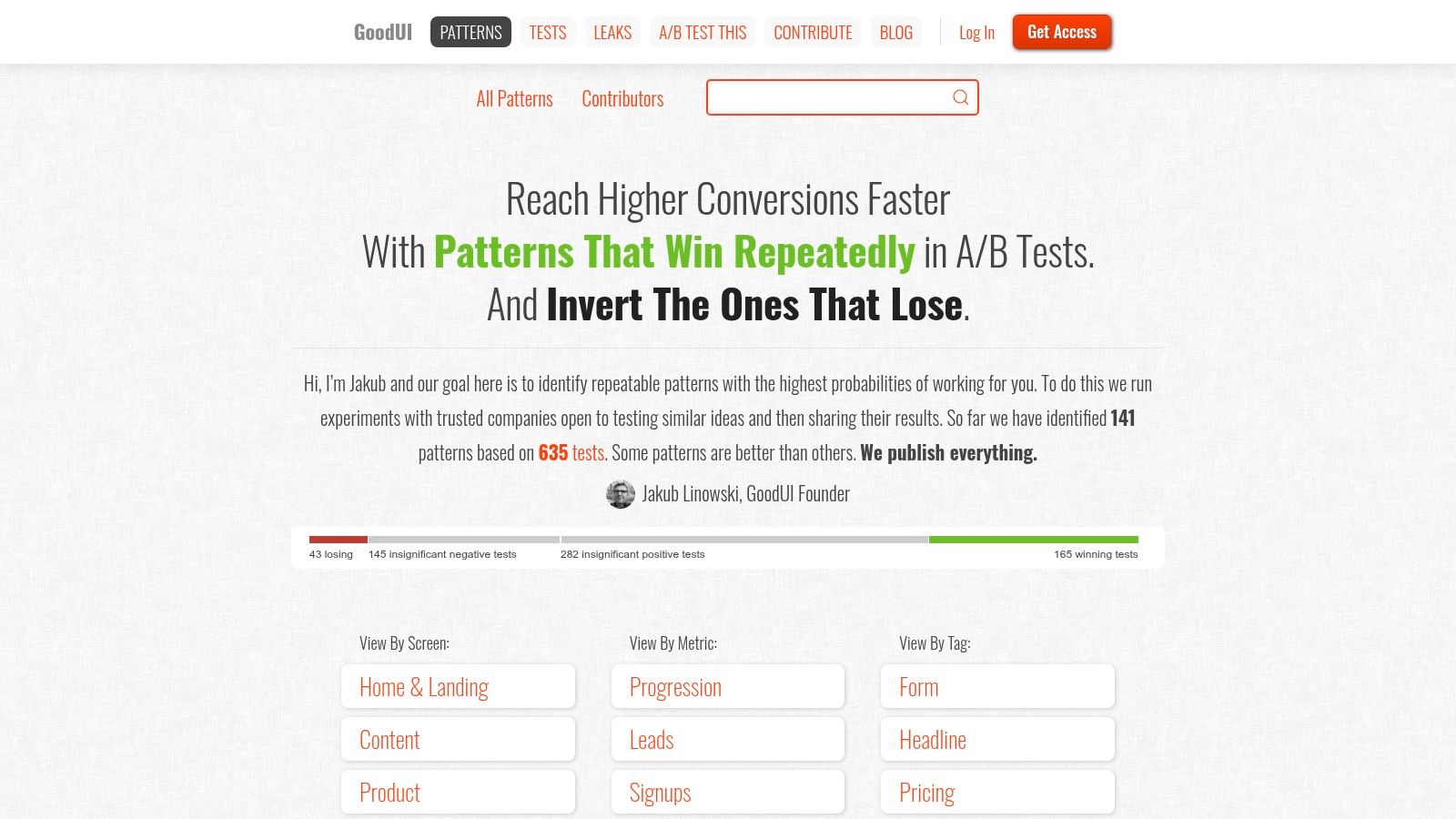
GoodUI is the most evidence-driven example in this list. It doesn't sell the idea of UX optimization with generic advice. It catalogs patterns, links to test write-ups, and gives readers a reason to keep digging. That makes it a natural link magnet for product, UX, and marketing audiences.
GoodUI Information Architecture
The page is built as a pattern index with drill-downs to evidence. That structure scales cleanly because each new experiment can fit into the same taxonomy without rewriting the page's purpose. For a pillar page, that's gold.
The model is especially useful when your content is data-first. You're not trying to explain a broad concept through prose alone. You're building a reference system that lets readers move from pattern to proof with minimal friction.
GoodUI Internal Linking Topology
The internal linking is simple and effective. The index points to pattern pages, and those pages point to evidence. That creates a clear chain of relevance, which is exactly what a strong pillar-and-cluster system should do.
There's also a contribution path, which gives the site a built-in expansion mechanism. That matters because evidence-based hubs get stronger when the collection grows. The page becomes more useful over time instead of aging into a static archive.
GoodUI Schema and E-E-A-T Signals
The strongest signal here is the evidence-first approach. Readers can see that the page is grounded in experiment data, not opinion dressed up as expertise. That kind of transparency is hard to fake and easy to trust.
The niche terminology is the downside. Non-UX readers may need a little translation before the structure clicks. Even so, the page is one of the cleanest examples of how to turn proof into a scalable content asset.
GoodUI Content Brief
The brief is built around experimentation, not explanation. It assumes the reader values test results, pattern libraries, and repeatable insights more than narrative polish. That makes it ideal for product teams, conversion specialists, and UX researchers.
If you need a pillar page that can attract links because it contains real evidence, this is the model to study. It's not the broadest page in the set, but it may be the most durable.
The index lives at GoodUI's patterns hub.
Top 7 Pillar Page Examples, Comparison
| Example | Implementation complexity | Resource requirements | Expected outcomes | Ideal use cases | Key advantages |
|---|---|---|---|---|---|
| Typeform | Medium, long-form layout, TOC & anchors | Moderate, design, structured content, citations | Readable pillar that supports topical clustering and trust | Brand awareness guides and teach-first pillar pages | Scannable structure, balanced linking, freshness |
| Ahrefs | High, chaptered hub-and-spoke IA with data visuals | High, expert authors, data, frequent updates | Strong topical authority and SEO E‑E‑A‑T signals | Canonical educational guides and foundational resources | Replicable topical model, high authority |
| Backlinko | High, hub-of-hubs with extensive crosslinking | High, editorial effort, interlink strategy, design | Very discoverable content and consolidated topical authority | Complex topics needing sub-hubs (e.g., SEO libraries) | Excellent discoverability, scalable IA pattern |
| Shopify | Medium, tactical What/Why/How structure, checklists | Moderate, commerce expertise, tactical content, updates | Business-focused traffic→sales guidance, practical adoption | Ecommerce/DTC guides and commerce-focused pillars | Outcome-oriented, tactical checklists, commerce relevance |
| BigCommerce | Medium–High, multi-format hub with conversion paths | High, up-to-date research, PDFs, product integrations | Timely authority on ecommerce SEO with lead-gen potential | Ecommerce pillars requiring freshness and trial conversion | Timeliness, multi-format distribution, clear CTAs |
| Asana | Medium, curated taxonomy, card layouts and tags | Moderate, content aggregation, taxonomy work | Improved navigation, reduced pogo-sticking, funnel support | B2B SaaS resource centers and knowledge hubs | Strong navigational pillar, easy to model for SaaS |
| GoodUI | Medium, indexed pattern hub with drill-down evidence | Moderate, experiment data, contributor workflows | High credibility and link-attracting evidence hub | UX/PM pattern libraries and experiment repositories | Evidence-first approach, scalable index, high utility |
Your Pillar Page Blueprint Ship One in the Next 30 Days
A strong pillar page starts with a topic that deserves ownership, not a keyword that merely has volume. Pick the parent term, then audit search intent until you know whether the page should educate, compare, or convert. That decision controls the information architecture, the internal linking plan, and the content brief, so don't write a line before you've made it.
Next, map the hub and the spokes. A practical benchmark is to build a 1,500 to 2,000 word hub that maps to 5 to 7 subtopics, then measure it in Google Search Console by impressions, average position, and internal-link CTR, as outlined in this industry guide on pillar page examples. If your topic needs more depth, the supporting cluster pages should absorb the detail, not the hub.
Use the content brief to lock in entity coverage and section order. Then wire the page with bidirectional links, because a pillar without return paths becomes a dead-end article. The linking guidance that matters most is simple, at least 5 to 10+ links from the pillar to cluster pages, and 1 to 2 links back from each cluster page, with lateral links only where they help the reader, as described in this pillar-page linking guide from Tatarek.
Ship the hub, then publish the spokes fast enough that the page doesn't sit alone. A healthy pillar doesn't win because it's long, it wins because it's surrounded by a coherent cluster that keeps the topic alive. If you need a workspace to organize that plan, Nuwtonic's content operations layer fits the job because it can help teams schedule, bulk-publish, and maintain cluster content around a pillar without losing topical authority. For adjacent knowledge-base planning patterns, this best knowledge base examples 2026 round-up is useful for seeing how structured hubs hold together in practice.
Nuwtonic helps SEO teams turn pillar page plans into executed cluster systems. It connects keyword clustering, content operations, and reviewable publishing workflows so a hub page can ship with its supporting spokes instead of sitting as a one-off draft. Visit Nuwtonic if you want a workspace for building and maintaining pillar content at scale.